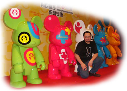
You might be unfamiliar with Raymond Choy's name, but you may have seen his Qee Bear and Qee Keychain collection, right? Mr Choy is a famous Hong Kong designer, and his Toy2R brand is well respected internationally. Yet this was the first time he had ever collaborated with a public organisation. After being briefed about the contents of the HA's new service culture, he began his creative work by adopting a "people-centred" approach. Eventually, he submitted quite a lot of design ideas, including ones depicting bears, dogs, cats and human beings. Our Design Manager, Mr Lee, told us that an image of a bear stood out among them, due to its big ears and its cuddly and lovable look. It was agreed to make this the design theme. Once the figure of a bear had been confirmed, Mr Choy continued his work, using white to reflect the professional image of doctors and nurses, and elaborating it further. |
||||||
|
||||||
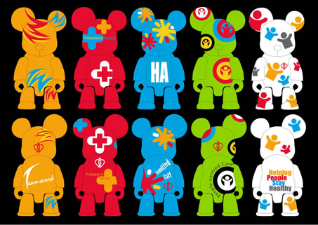
Apart from Mr Choy's ideas, Mr Lee also provided a lot of input. "We wanted to highlight the meanings of the values in subtle ways. All the graphics of the bears have been designed with that in mind." he explains. Mr Lee went on to describe their symbolic features one by one. "The white bear stands for 'Helping People Stay Healthy'. We used images of people to express that idea. The green one denotes 'People-centred Care', so we thought of having a person in the middle of two circles to illustrate the people-centred concept. "The red bear conveys the idea of 'Professional Service'. The cross has a kind of medical look. We adapted it and revised it further by adding some crosses with rounded corners, so that they did not look too harsh. The blue one indicates 'Committed Staff', meaning people working happily. So we added fireworks to energise the viewer. Finally, the orange one signifies 'Teamwork'. We used the letters 'TW', and adapted them to express the notion of synergy." |
||||||
|
||||||
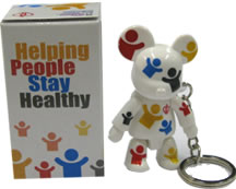
By now, you've already received your personal "VMV Bear" keychain, right? We feel sure you're happy to have it. So let's also remember the new service culture and firmly establish it in our workplaces. |
|
|||||