Every figure is the result of blood, sweat and tears
 It’s known as the ‘castle in the sky’ – but the data and statistics provided by the office tucked away between the mezzanine floor and first floor of the Hospital Authority (HA) Building are as grounded and down to earth as you could learn from the 430 press briefing throughout the epidemic. These statistics were prepared by the Statistics & Data Science Department, and were instrumental in allowing experts to draw insights from data analysis.
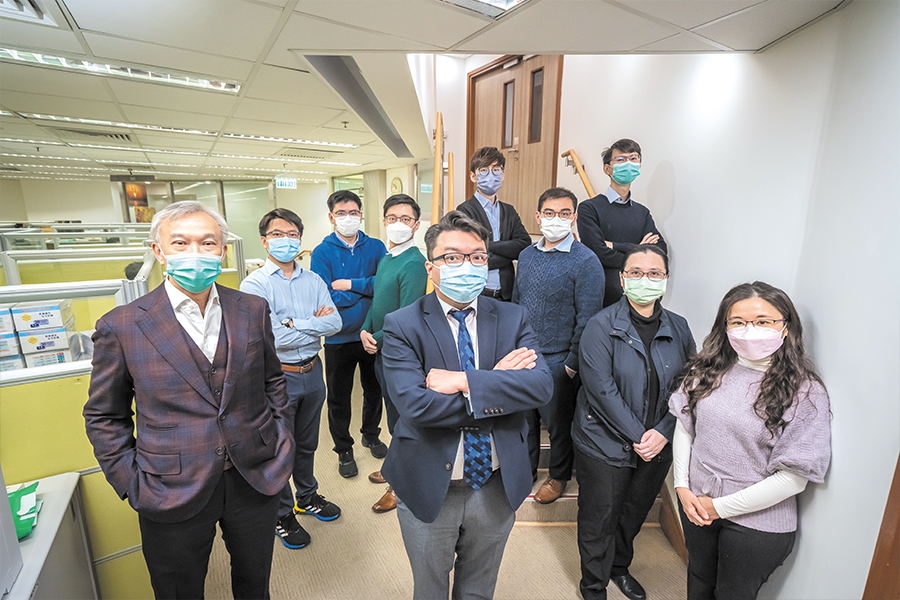
“Every figure is the result of blood, sweat and tears,” says Chief Health Statistician Alan Cheung, describing his team’s work in data processing. Since the fifth wave, the team has closely tracked the epidemic’s progress and aggregated nearly 100 statistical items a day, including the number of hospitalised cases, severe cases, deaths, sex ratio and age distribution among these cases, with data coming from different sources.
With nucleic acid tests for example, information poured in from HA laboratories, as well as Public Health Laboratory Services Branch of the Department of Health and private laboratories, along with data from ‘Declaration System for Individuals Tested Positive for COVID-19 Using Rapid Antigen Tests’, vaccination records and medical records from the Clinical Management System. All these involved a large amount of data.
Making sense of an avalanche of data
The team does not have the data at fingertips. Sifting through different sources of data and figuring out the discrepancies were the most challenging tasks the department had to handle during the epidemic, according to Senior Health Statistician Mak Po-kong. “The operation of testing centres and laboratories were different, but data consistency is crucial,” he explains. “Colleagues had to cleanse the testing records for specimens with multiple testing results, then informed the colleagues working on data analysis. Mutual understanding was key to collaboration among different teams.”
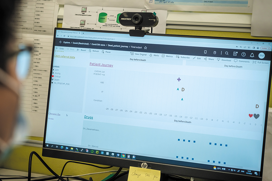
The team summarised the journey of the deceased on a dashboard from medical consultation and admission to deterioration and passing away. Senior Statistical Analyst Tom Li reflects, “to many people, the death cases were merely figures. But 20 cases meant 20 lives and 20 grieving families.”
“When we looked at the dashboard, it was as if we were looking into the whole life of a patient. It was very sad. What we could do, however, was to help experts understand the epidemic better through data analysis.”
Exceeding people’s expectations
Members of the public expected greater transparency from officials nowadays than they did during the SARS outbreak. This meant the Statistics & Data Science Department had to ensure statistical figures and related information were well prepared ahead for the spokesperson of the 430 press briefing and react quickly to changing situations. The team sometimes had to work overnight in order to meet tight deadline.At the beginning of the epidemic, the team designed a big data analytics model to predict the progression of the disease through analysis of patient data for triaging.
From the time of the fifth wave, the then Food and Health Bureau commissioned the team as a technical agency to handle territory-wide COVID-19 data. Whatever their status, Alan Cheung and Mak Po-kong say they appreciate the selfless dedication of their colleagues in helping deploy data and information, contributing to the efforts in fighting against the epidemic.